In today’s market, customers encounter products long before they ever touch them in a showroom. Homeowners are researching and planning kitchen and bathroom projects through digital and social channels such as Pinterest, Instagram and manufacturer websites. For products historically evaluated by touch and physical presence, this shift has fundamentally changed the first impression.
This change has also placed increased pressure on distributors and dealers, who rely heavily on manufacturer-provided imagery to educate, inspire and convert customers. Lifestyle photography, project imagery and computer-generated imagery (CGI) all play a role in helping sales staff explain how a product looks, functions and fits into a real space. When visuals are thoughtfully designed, they reduce friction in the sales process, build confidence and shorten decision timelines.
While both photography and CGI have value, the true differentiator is not the medium itself, but the strategy behind the image. Manufacturers who understand how visuals shape perception give their distributors an advantage by providing assets that support sales conversations.
Designing for ‘attainable aspiration’
One of the most common mistakes manufacturers make is aiming too high with their visuals. Ultra-luxurious rooms and fantastical scenes may look impressive, but they often create distance rather than connection.
Customers struggle to imagine those products in their own homes and showroom staff find them harder to reference during consultations.
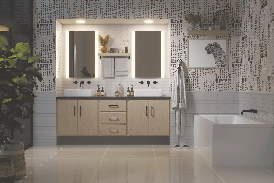
The most effective visuals strike a balance between aspiration and realism, or “attainable aspiration.” The space should feel stylish and inviting, showcasing the product in a way that is achievable, approachable and appropriate for the target market.
When done well, attainable aspiration allows customers to picture the product in their own environments while giving dealers a reference point for discussions around layout, finish selection and application.
Common visual mistakes reducing sales impact
Many manufacturers unintentionally undermine their own products through visual missteps that distract from, rather than support, the sale.
Busy or overly styled backgrounds compete with the product and make it harder for dealers to highlight key features. Cramped layouts or unrealistic proportions also break believability, especially when fixtures are placed in ways that would never be installed in a real home.
Another common issue is mismatched or short-lived styling. Trend-driven rooms may look current today but can quickly feel dated, reducing the long-term value of marketing assets. Visuals should support a product’s lifecycle, not limit it.
Showroom-based lifestyle photography can also create problems. While convenient, these images often introduce elements that break realism, such as drop ceilings or harsh vignette lighting.
In CGI, poor material mapping is especially damaging. Even small errors in reflectivity, texture or scale immediately signal that something is off. Accurate CGI renderings, on the other hand, allow the viewer to focus on what matters most: the product.
Principles for proper product representation
Clear, accurate visuals allow sales teams to explain product advantages faster and reduce reliance on large sample inventories. When visuals are built with strong design fundamentals, the product naturally becomes the focal point rather than getting lost in the environment.
Consistent visuals across catalogs, websites and portals also strengthen brand identity and build long-term dealer confidence.
1. Lighting
Proper lighting is crucial in product imagery because it directly affects how finishes, proportions and materials are perceived. Lighting color temperature also plays a major role. Brushed brass, for example, can appear dull, overly orange or flat when lit incorrectly, while reflective finishes can lose clarity or depth under inconsistent lighting.
Daytime or daylight-balanced scenes tend to feel more open, neutral and approachable, making them highly effective for early-stage decision-making. Nighttime or low-light scenes introduce contrast and mood, which can work well for hero imagery or environments where wood tones and richer materials benefit from controlled, directional light.
2. Color
Before viewers register materials or form, they register color. In product imagery, color serves as a visual cue, shaping how an item is interpreted emotionally and stylistically.
Warm palettes tend to feel inviting, while cooler palettes read as modern and minimal. Using neutral colors allows the product to remain the focal point rather than compete with the space.
Because most products are not shown in every finish, the selected hero image finish plays a large role in perception. Brass tones can introduce warmth and approachability. Polished chrome feels crisp and high-precision and can brighten a space. Matte black reads bold and contemporary. Wood finishes can reinforce this messaging, with lighter tones feeling airy and modern and deeper woods reading as grounded and refined.
Together, these choices define how a product is understood.
Using buyer personas and regional preferences to shape visuals
Every stakeholder interacts with visuals differently. Designers look for mood, material accuracy and intentional composition. Showroom sales teams want finish variety and clear feature visibility. Homeowners respond to relatability and inspiration. Contractors and specifiers need realistic layouts and proportions that reduce guesswork.
A strong visual strategy requires an image arsenal that speaks to all these groups simultaneously. Creating clear buyer personas helps manufacturers and distributors understand how each stakeholder influences the buying decision and how visuals should support conversations, from early inspiration through final specification.
Regional design cues add another layer of meaning. Materials, wood tones, lighting temperature and architectural context act as visual shorthand that helps distributors explain why a product belongs in a particular home or lifestyle.
For example, brass finishes may read as warm and traditional in the Southeast, while cleaner lines, lighter woods and understated finishes align more closely with California design expectations. Polished chrome can feel timeless in the Northeast but may read as too clinical in the Midwest.
It’s important to view regional design cues as guides rather than rules: useful for resonating with specific lifestyles, communities or brand narratives, rather than defining a market in rigid terms.
Planning the right mix of visual assets for dealers
Showrooms and distributors benefit most when manufacturers provide a complete visual ecosystem rather than a limited set of images.
Hero scenes set the emotional tone and provide high-impact assets for websites, social media and showroom displays. Close-ups and detail shots highlight finishes, textures and craftsmanship, increasing buyer confidence.
Cutouts in multiple finishes allow dealers to show SKU variations without expanding physical inventory. Functional or technical and exploded views support installers, contractors and specifiers.
Together, this mix supports awareness, education, comparison and final decision-making.
Practical takeaways for manufacturers and distributors
Design for attainable aspiration. Visuals should feel stylish but believable, helping customers imagine the product in their own homes and giving dealers confidence to sell it.
Use lighting and color intentionally. Lighting temperature, direction and color palettes shape how materials and products are perceived. Use a mix of daylight and mood lighting for emphasis.
Eliminate visual distractions that compete with the product. Busy backgrounds, tight layouts and mismatched materials pull attention away from the product. Strong visuals keep the fixture as the focal point.
Build visuals around buyer personas, then refine with regional context. Designers, sales teams, homeowners, and specifiers all rely on imagery in different ways. Effective visuals support each role while reinforcing real-world use.
Give dealers a complete visual toolkit. Hero scenes, close-ups, finish variations and clean cutouts work together to support product education, comparison and faster decision-making.
Better visuals build better partnerships
Visuals shape brand perception long before a rep visit or showroom conversation. Manufacturers and distributors who invest in strategic, accurate and thoughtfully designed imagery give their wholesale partners and showrooms a meaningful advantage.
Modern visualization tools make this approach scalable and cost-effective. When done well, strong visuals reduce friction, build confidence and help manufacturers and wholesale partners drive more sales together.
Ryan Newfell is the founder and creative director of Brass Bear Studio, specializing in computer-generated imagery and visual strategy for kitchen and bath manufacturers. He has more than a decade of experience in marketing, branding and product-focused design within the decorative plumbing and interiors industry. You can contact him at [email protected].